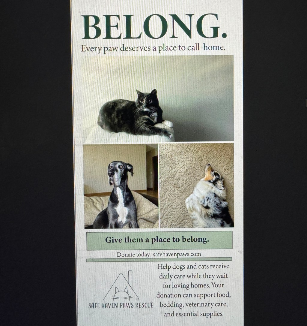
For this project, I created Safe Haven Paws Rescue, a fictitious charity that helps dogs and cats receive care and find loving homes. I used photographs I took myself to make the campaign feel personal and show how comfortable animals can be when they have a safe place to belong. My campaign includes a poster, brochure, print ad, Facebook ad, Instagram ad, and billboard, all connected through the same colors, logo, and message.
Developing My Campaign
I started with the idea that every animal deserves a safe home. I chose “BELONG.” as my main tagline and “Every paw deserves a place to call home” as my slogan.
I looked at Best Friends Animal Society and the Humane Rescue Alliance for inspiration on how animal rescue organizations communicate their missions and encourage people to get involved. That helped me decide to make donations my main call to action.
Instead of making up rescue stories about my pets, I used their photographs to represent the comfort and connection I would want this organization to provide.
Creating the Visual Design
I chose dark green, sage green, cream, and charcoal because I wanted a calm, welcoming feel.
In Illustrator, I used the Pen and Curvature tools to create the logo, which was a house with a roof and chimney combined with a cat. The house represents shelter, and the cat makes it clear what the organization is about. It’s Vector, so it can be scaled up or down without losing quality.
I used Adorn Condensed Sans for the rescue name and Minion Variable Concept for the supporting text, with bold headings to separate the information.
I also experimented with placing the logo above or beside the organization’s name. I adjusted the sizes in my final draft so each version fits its layouts better.
Editing My Photographs and Layouts
I edited my photographs in Photoshop using Camera Raw to adjust brightness, highlights, shadows, contrast, and clarity. I also worked on the green tones so the images matched my color palette.
In InDesign, I used File > Place to bring in my photographs and Illustrator logo. I adjusted image frames, cropping, text sizes, and spacing to create a clear reading flow.
I made “BELONG.” the largest text in most designs so people would notice the campaign message first. I also considered how people would view each advertisement. The billboard has very little text, while the brochure provides more detailed information about the organization.
Peer Feedback and My Final Revisions
After getting feedback from Bailey Stahl and Lindsey Willis, I revisited my designs.
Lindsey suggested centering “Give them a place to belong” inside the sage-green box on my poster. I made that adjustment and also centered the supporting paragraph beside the logo. I felt this made the bottom of the poster easier to follow.
When I went back through my brochure, I felt like some sections had more white space than they needed. Since the headings already separated the information, I moved the paragraphs a little closer together, I also fixed a heading that wasn’t completely bold and caught a few grammar mistakes. Because the brochure has quite a bit of text, I used a 16-point font with 22-point leading to keep everything readable. I also enlarged a sage-green rectangle to use the space better.
For the print ad, I kept the two photographs because I liked how the animals almost looked like they were looking at each other. I played with the cropping, text size, and spacing, then settled on “Donate Today” centered in its sage green box as the call to action.
I also refined the Facebook advertisement’s alignment and spacing. On Instagram, I adjusted the website and organization name after Lindsey pointed out that they were misaligned.
Bailey suggested using a more straight on photograph of my dog. After considering that feedback, I decided to keep the original image. My dog looks relaxed and comfortable, which conveys the sense of safety at home I wanted for this campaign.
Finally, I adjusted the cat photograph’s placement within the billboard border, reviewed the design’s readability, and proofread my social media captions.
Final Thoughts
Looking back at my first draft, I was happy with the overall direction of my campaign, so I didn’t want to completely redesign anything. Going through each piece again helped me notice little things I had missed, especially with the spacing and placement of the text. I appreciated my classmates’ feedback because they pointed out things I might not have noticed on my own. I also realized that I didn’t have to make every suggested change. I wanted the final designs to look cleaner while still keeping the personal feeling of my original photographs.
References
Castle, — Julie, & Officer, B. F. C. E. (n.d.). Homepage. Best Friends Animal Society. https://bestfriends.org/?form=FUNLJQZPGEN&gclid=e0b4e8d399bf1a9042fb821fbfaa364f&gclsrc=3p.ds&msclkid=e0b4e8d399bf1a9042fb821fbfaa364f
Humane Rescue Alliance. Humane Rescue Alliance – Pet Adoption and Training Services. (n.d.-b). https://www.humanerescuealliance.org/


Leave a Reply