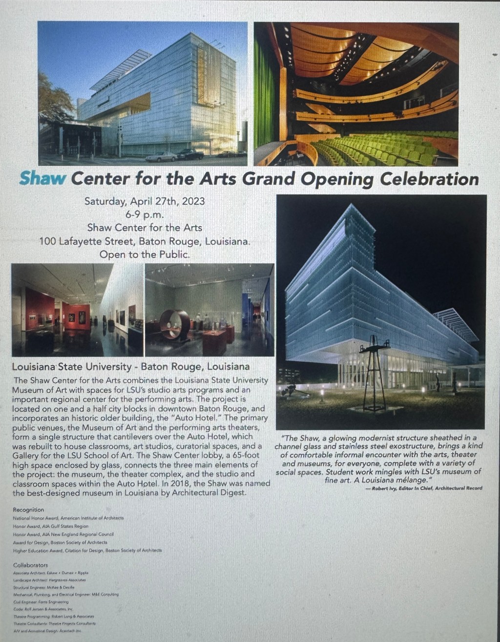
For my graphic design project, I created a promotional campaign for the Shaw Center for the Arts, including a poster, print invitations, a Facebook post, an Instagram advertisement, and a social media caption. The goal was to create designs that worked across different formats while still feeling like parts of the same campaign. After completing my draft and receiving peer feedback, I focused my revisions on visual hierarchy, spacing, alignment, image placement, and readability.
Developing the Original Design
One of my main inspirations was the Shaw Center’s architecture. The photographs have strong lines, glass, and blue tones, so I wanted my typography and colors to complement those features. I made “Shaw” blue while keeping the rest of the title black. Both of my peers liked this choice and mentioned that the blue complemented the exterior photographs, so I kept it throughout my final designs.
Imagery was also important because I wanted viewers to notice the building, theater, museum spaces, and architectural details, so I chose a variety of images provided to showcase almost all of the building’s features.
Learning From Peer Feedback
The biggest issue identified in my feedback was spacing and visual hierarchy. Some areas of my draft felt crowded while others had too much trapped white space. My peers also suggested making important information, such as the title, date, and time, more prominent. I was encouraged to use consistent margins, gutters, and spacing between images and text.
I also needed to make smaller changes, including adding punctuation after “Open to the Public,” improving the social media caption, and reconsidering how much information should appear in each design.
Revising My Designs
I made the largest changes to my poster. I adjusted the margins and padding around the photographs so they have separation without creating excessive white space. I also changed the title from two lines to one and adjusted the font sizes throughout the design. The most important information is now larger, while supporting information is smaller. I moved the date and time closer to the title and made sure the text does not hug the photographs. My main goal was to push unnecessary white space toward the outside of the design while still using spacing to show which pieces of information belong together.
For the print invitation, I replaced the Robert Ivey quote with information about Louisiana State University and the Shaw Center. I felt this was more informative for someone receiving an invitation because it provides location details instead of only giving them a quote.
For the Facebook post, I modified the size of the title, date, and time to create a clearer hierarchy. I also repositioned the photographs so they have similar padding and reduced trapped white space.
The Instagram design required a different approach because people usually view social media content quickly. I removed some of the longer informational text and added another photograph instead. This made the design more visual and less overwhelming for someone scrolling through a feed. I also adjusted the spacing so the images have consistent separation and the text does not sit too close to them.
Finally, I revised the social media caption by adding “Saturday” to the event date and making the Shaw Center for the Arts bold so the venue stands out more clearly.
Using Adobe InDesign
I revised the project in Adobe InDesign using the provided document dimensions for each format. I used text and image frames to control placement of information and photographs. During revision, I minimized font sizes and adjusted image crops, margins, padding, alignment, and spacing. Working with these tools helped me understand how small changes can affect the balance of an entire layout.
One of the biggest things I learned was that white space needs to be intentional. My revisions weren’t about eliminating white space, but controlling where it appeared. By reducing trapped white space, improving hierarchy, and creating more consistent spacing, I made the final campaign easier to read while keeping the visual style that worked well in my original draft.
Overall, the peer feedback helped me look more critically at my designs. I kept successful elements, especially the blue “Shaw” and architectural imagery, while making purposeful changes that improved readability, balance, and consistency across the final campaign.
 Hope Montgomery - Strategic Communication
Leave a comment