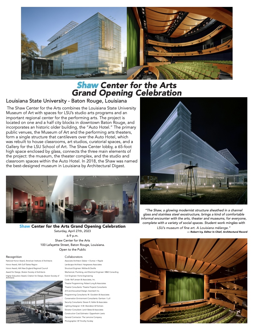
When designing promotional materials, I wanted to create a campaign that communicated the importance and visual appeal of the Shaw Center for the Arts while adapting the information for different audiences and platforms. My project includes a print invitation, a Facebook post, an Instagram advertisement, and a social media captain. Although each piece has a different format and purpose, I wanted the campaign to feel consistent and connected.
Starting With Visual Hierarchy
One of the most important concepts I considered during the design process was visual hierarchy. Because each design contains several pieces of information, I needed to make sure viewers could quickly identify the most important details. I made the event title “Shaw Center for the Arts Grand Opening Celebrating,” one of the strongest visual elements. The date, time, location, and “Open to the Public” information follow the headline so viewers can easily find the information they need to attend the event. These details appear consistently throughout the campaign.
I also used contrast to separate different elements and draw attention to the headline. The title uses black and blue text, while the photographs provide additional visual contrast. The blue color emphasizes “Shaw” and complements the cool tones visible in several of the building photographs.
Using Images to Tell the Story
Photography became an important part of my design because the Shaw Center itself is visually interesting. Instead of relying entirely on written descriptions, I used photographs to allow the audience to see the building, theater, museum spaces, and architectural details. The first page combines multiple photographs to provide a broader understanding of the Shaw Center, while the social media designs use fewer images to accommodate their smaller fonts.
I also considered proximity and alignment when organizing photographs and text. Related information is grouped together, while spacing helps separate different sections. This was especially important for the Facebook and Instagram designs because there is a significant amount of information competing for attention.
Designing for Different Platforms
Another major part of the project was adapting the campaign for different communication channels. The print invitation was designed at 8” x 5”, the Facebook graphic at 1200 x 630 pixels, and the Instagram graphic at 1080 x 1080 pixels.
Rather than simply resizing the same design for every platform, I adjusted the placement of the photographs, text, and white space to fit each format. The print invitation has more room for traditional layout, while the social media graphics need to communicate information quickly to someone scrolling through a feed.
Executing the Design in Adobe InDesign
I created the project using Adobe InDesign, using separate document dimensions for each deliverable. I used text frames to organize the event information and descriptive copy and image frames to place and resize photographs. I adjusted typography, spacing, alignment, and image placement to create a consistent visual system across the campaign.
I also used InDesign’s layout tools to maintain consistent margins and spacing while positioning elements for each platform. After completing the layouts, I exported the finished project as a PDF for digital sharing.
Overall, this project helped me understand that effective graphic design is not simply about making something look appealing. It requires intentional decisions about hierarchy, contrast, alignment, proximity, balance, typography, imagery, and audience. Creating multiple versions of the Shaw Center campaign allowed me to see how the same message can adapt across communication channels while maintaining a consistent visual identity. The final designs combine architectural photography, event information, and descriptive content to create promotional materials that are informative, organized and visually engaging.
 Hope Montgomery - Strategic Communication
Leave a comment